|  Case Studies / Planning & Advice |

A Centralized Resource Hub for Medicare Decision-Making

Designing a unified experience to help seniors explore Medicare topics, tools, and next steps with clarity and confidence.

Role: UX Designer
Platform: Responsive Web
Focus: Information architecture, content discovery, navigation systems
The Problem
Medicare-related content was distributed across multiple pages and sections, making it difficult for users to discover relevant resources or understand where to begin. Users often arrived with broad questions but lacked a clear path to move from learning to decision-making.

This fragmentation increased cognitive load, slowed discovery, and made it harder for users to find the right information at the right time.
Context
The Planning & Advice hub was created as a new, centralized experience within the site. It brought together educational content, calculators, videos, and decision tools—including the Medicare Advice Center, into a single, cohesive framework designed to support progressive learning and informed decision-making.
Constraints
  • Senior audience with varying levels of digital comfort
  • Large volume of existing content
  • High-stakes financial and healthcare decisions
  • Need to align with an existing design system and compliance standards
Goals
  • Centralize Medicare-related resources in one clear location
  • Support both high-level browsing and deeper topic exploration
  • Improve discoverability of tools and calculators
  • Create a flexible structure that could scale with future content
Structuring the Resource Hub
The Planning & Advice hub was designed to act as a content framework rather than a single destination page. Topics were grouped into clear, recognizable categories to help users quickly orient themselves and choose a path that matched their intent.
Content was structured to support:
  • High-level browsing for users just beginning their research
  • Deeper exploration for users focused on specific Medicare topics
  • Easy discovery of tools and calculators when users were ready

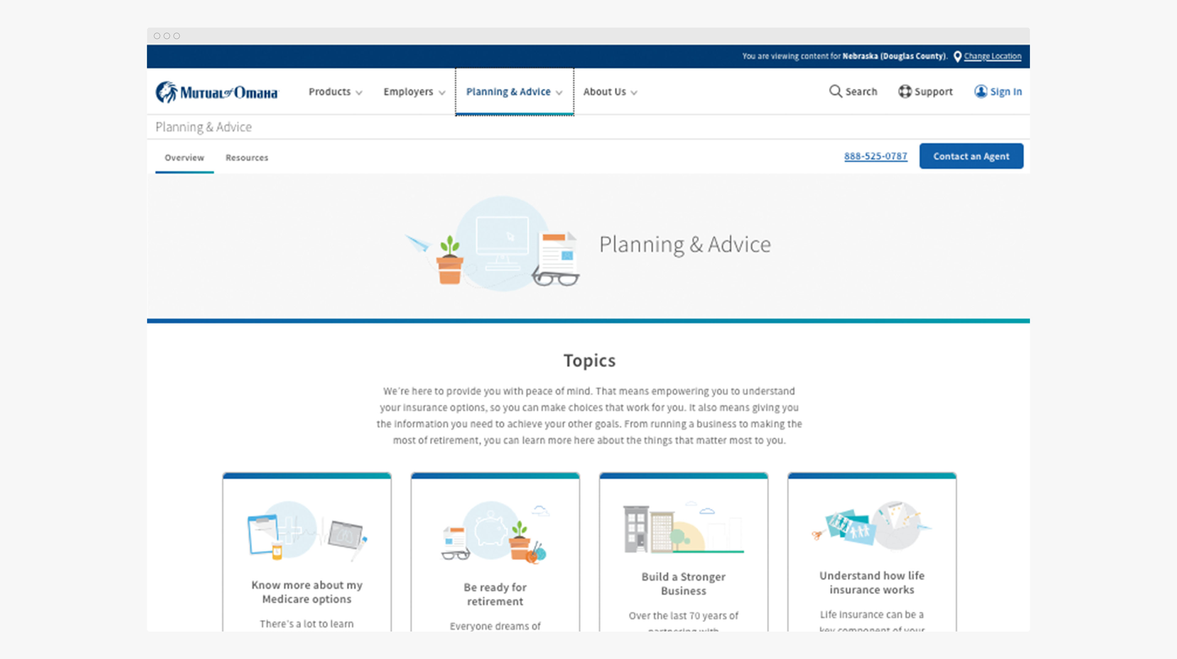
A centralized landing experience organizing Medicare topics into clear, approachable categories.

Designing for Content Discovery
To reduce friction and overwhelm, content presentation emphasized scannability, hierarchy, and progressive disclosure. Articles, videos, and tools were surfaced in consistent patterns, allowing users to compare options and explore related topics without feeling lost.

The layout balanced clarity with flexibility—supporting multiple entry points while maintaining a cohesive visual and structural system.

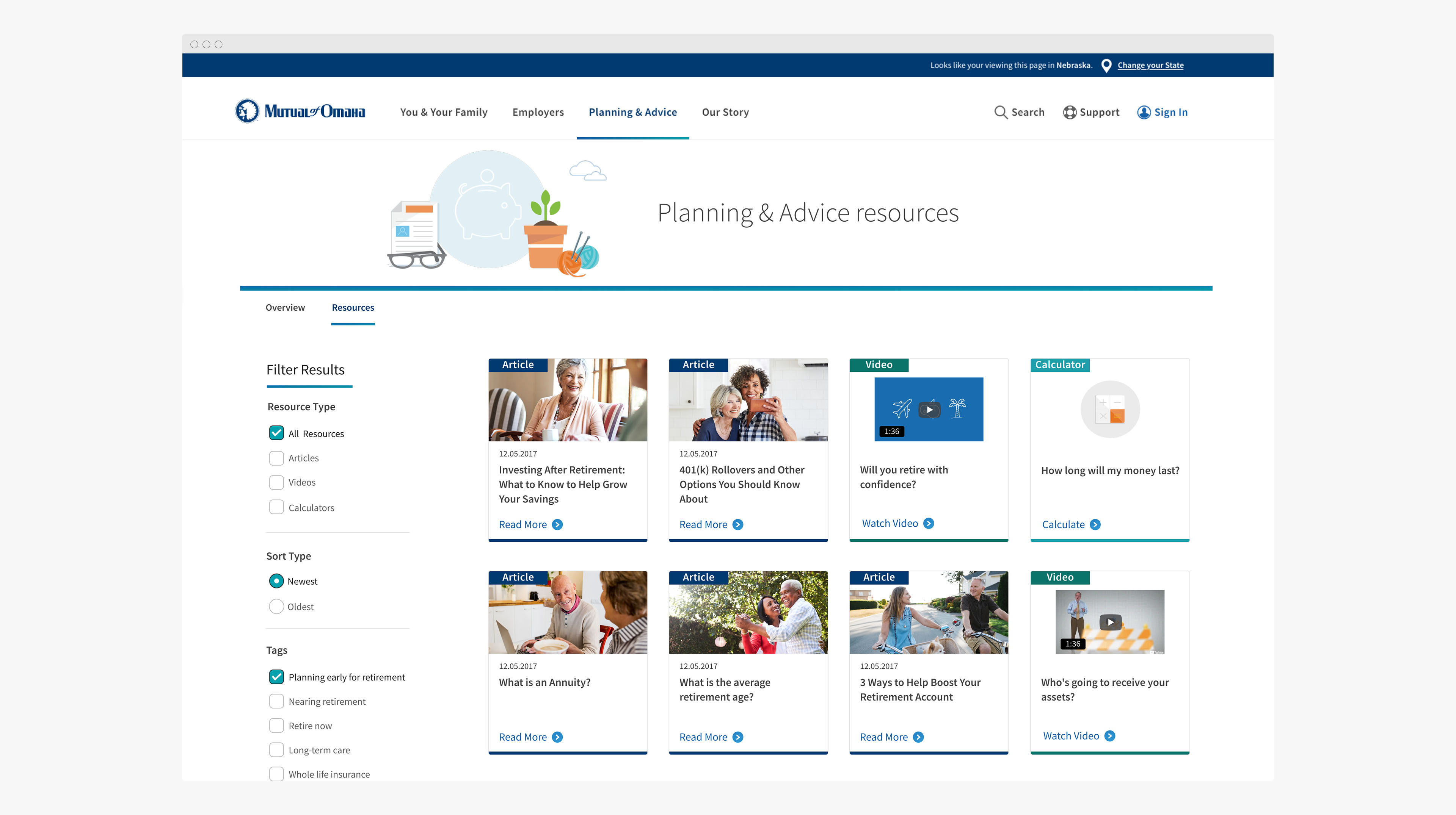
Modular content patterns designed for easy scanning and exploration.

Supporting Navigation and Orientation
Because users were often exploring unfamiliar topics, navigation patterns played a critical role in maintaining orientation and reducing cognitive load. The mega menu was designed to act as a decision aid, helping users quickly understand available topics and move confidently between learning, tools, and next steps.

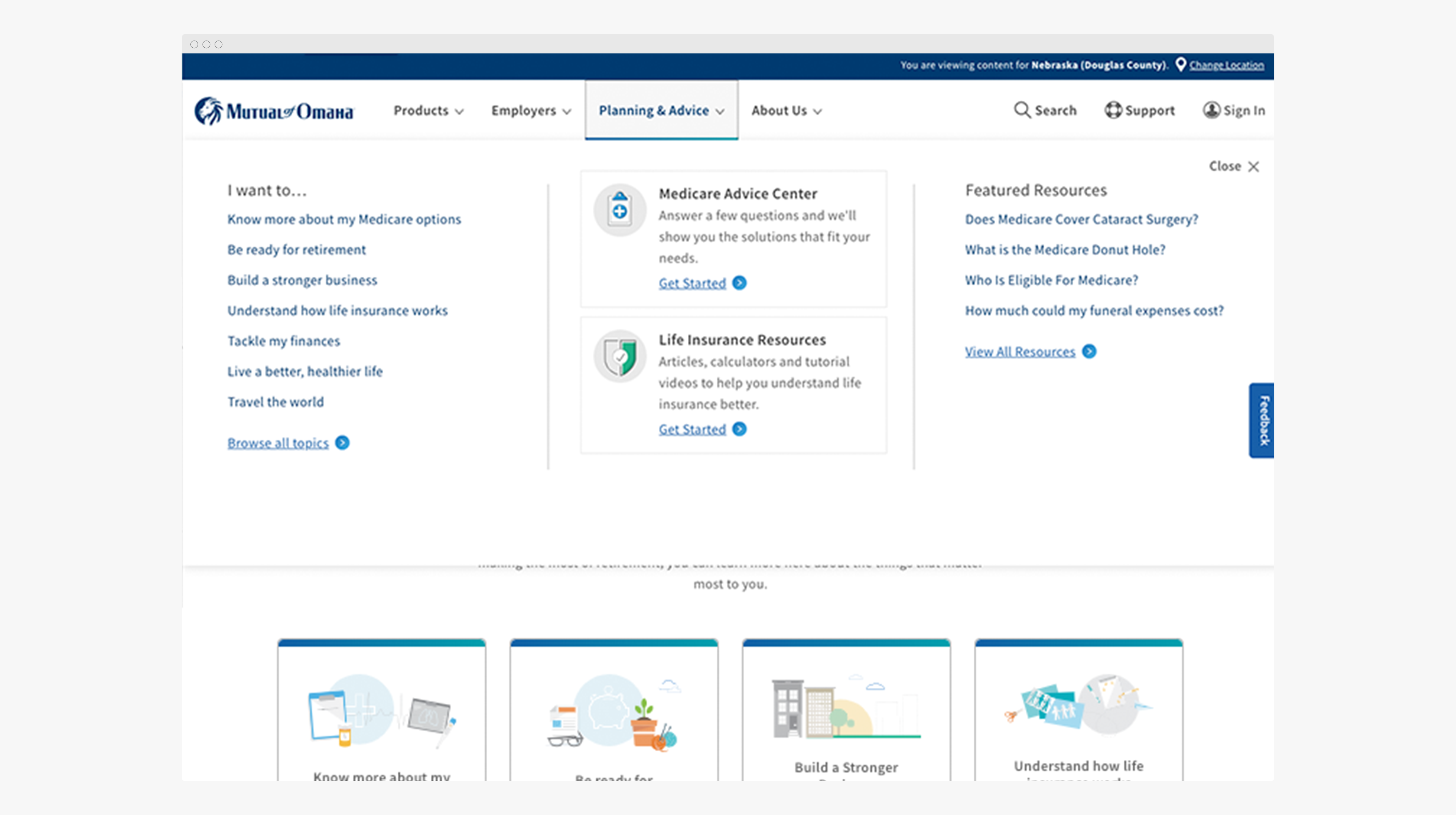
A structured mega menu providing clear pathways across topics, resources, and decision tools.

Supporting Multiple Learning & Decision Paths
Users arrived with different goals—some looking to learn, others ready to evaluate options. The Planning & Advice experience was designed to support multiple paths within a single, cohesive system.
Content was structured to let users move naturally between formats based on their needs:
  • Articles for foundational education
  • Interactive calculators for evaluating personal scenarios
  • Results views that translated inputs into clear, actionable insights
  • Video content for guided, low-effort learning
Rather than isolating each format, the system connected them—helping users progress from understanding a topic to making informed decisions.

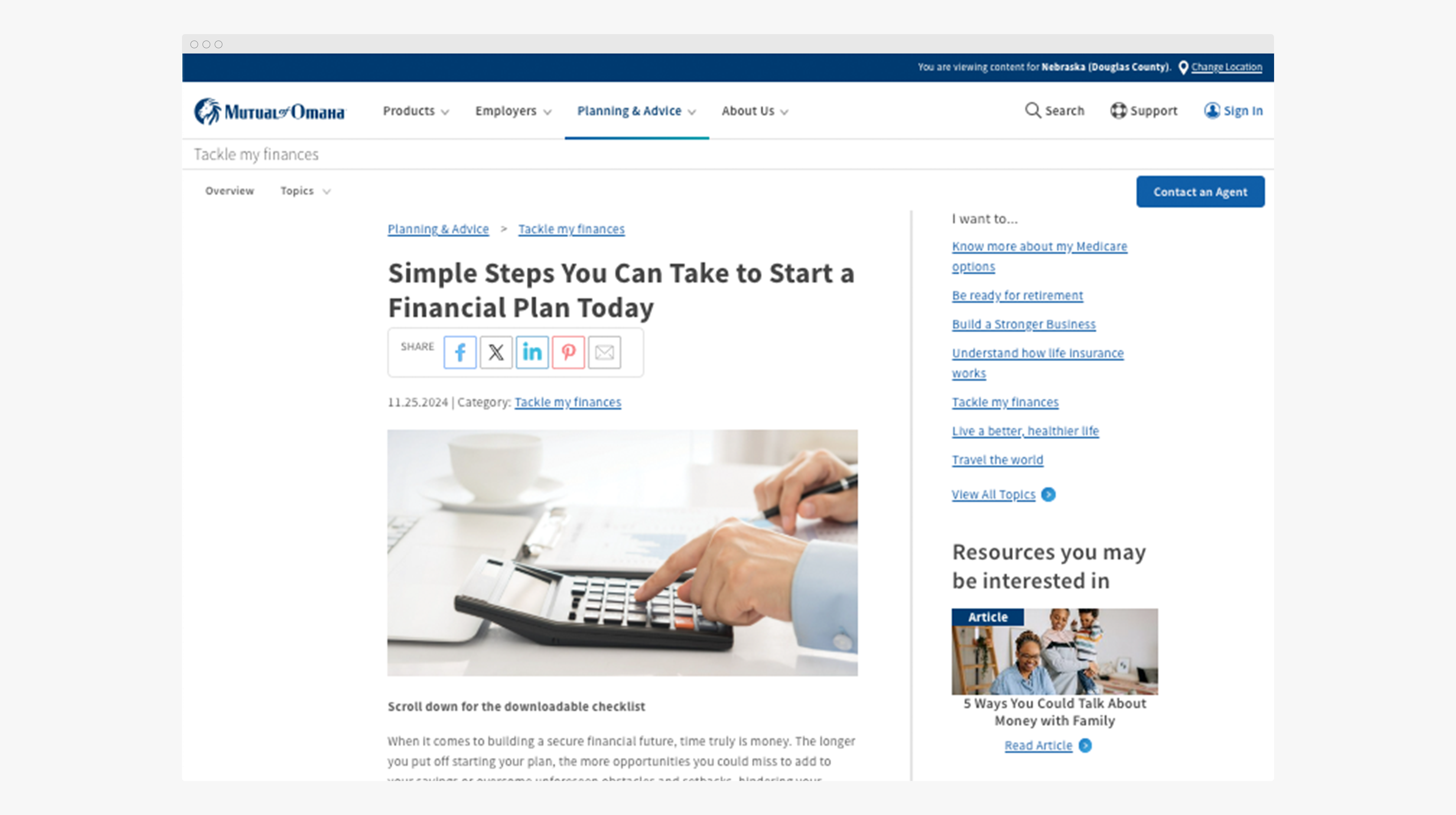
Educational content designed for clarity while staying connected to tools and next steps.

Clear, comparable results that turned inputs into meaningful insights.

UX Process & Tools
  • Information architecture and content grouping
  • Information architecture and content grouping
  • Design system–aligned UI patterns
  • Collaborative iteration with product, content, and development partners
Impact & Key Takeaways
  • Centralized a previously fragmented content ecosystem
  • Improved content discoverability and navigation clarity
  • Created a scalable framework for future Medicare resources
  • Strengthened the connection between educational content and decision tools