|  Case Studies / Advice Center |

Simplifying Medicare Decisions Through Guided UX

Designing a short, structured advice flow to help seniors identify the right Medicare options and connect with an advisor.

Role: UX Designer
Platform: Responsive Web
Focus: Guided flows, IA, UI patterns
The Problem
Many seniors struggle to understand which Medicare plan options apply to their situation and what steps to take next. Prior to this work, there was no clear, guided experience to help users move from uncertainty to a recommendation. The challenge was to design a simple, confidence-building flow that could gather the right information without overwhelming users.
Context
The Advice Center was created as a new experience to support Medicare decision-making. It centered around a short questionnaire, under 20 questions, designed to gather essential information and guide users toward an appropriate recommendation and advisor connection.
Constraints
  • Senior audience with varying comfort levels
  • High-stakes decision making
  • Need to keep the flow short and approachable
  • Existing design system and compliance considerations
Goals
  • Ask only the most essential questions
  • Reduce cognitive load and uncertainty
  • Provide a clear recommendation at the end
  • Support a smooth handoff to an advisor
Structuring the Advice Questionnaire
The questionnaire was designed to gather only the information necessary to make a meaningful recommendation. Questions were ordered intentionally to feel conversational, progressive, and non-intimidating.

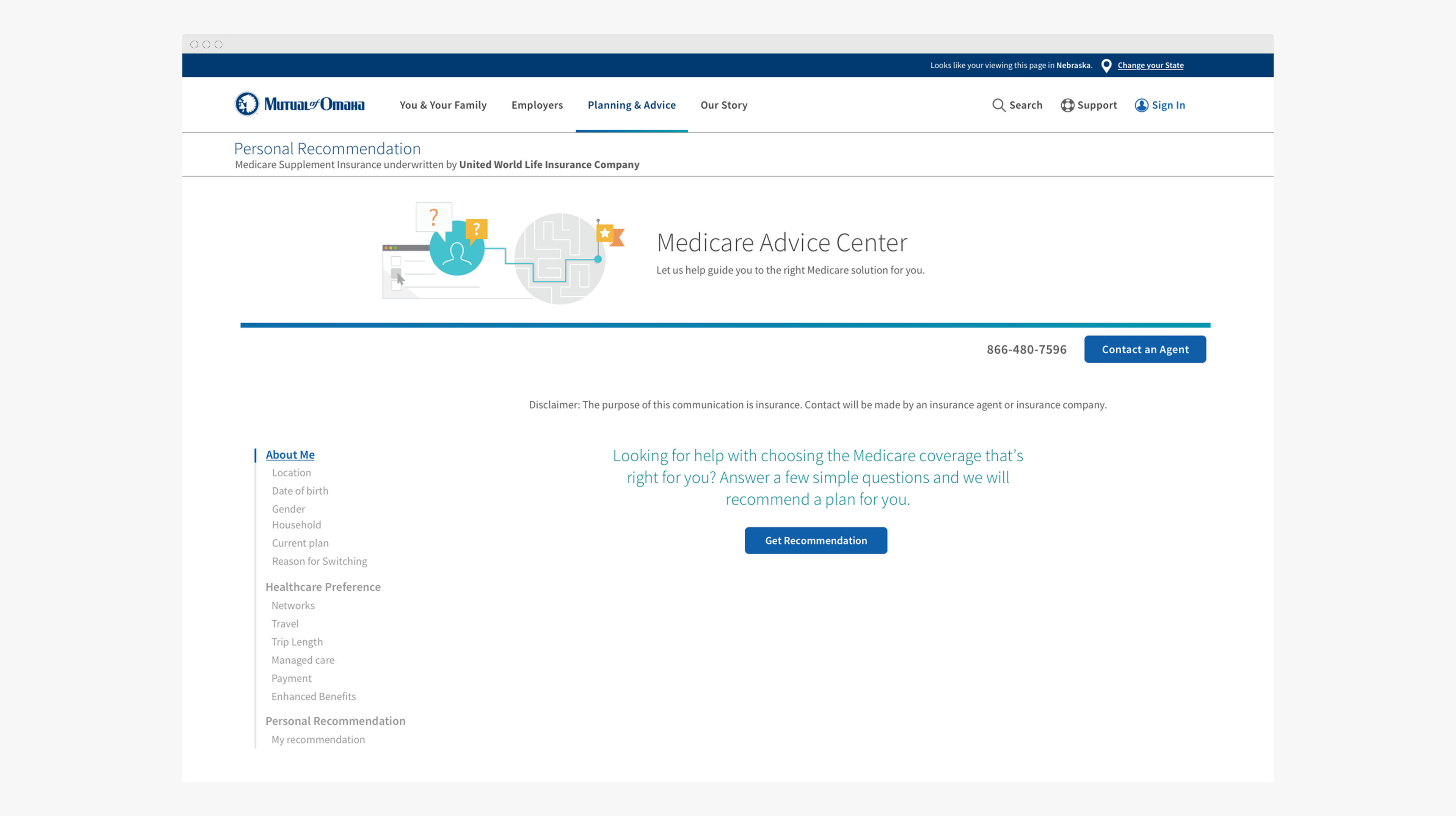
Short, progressive questions designed to reduce friction and keep users engaged.

Creating a Clear Recommendation Outcome
The final step needed to clearly explain the recommendation and guide users toward the next action. The design emphasizes clarity, reassurance, and an easy transition to advisor support.

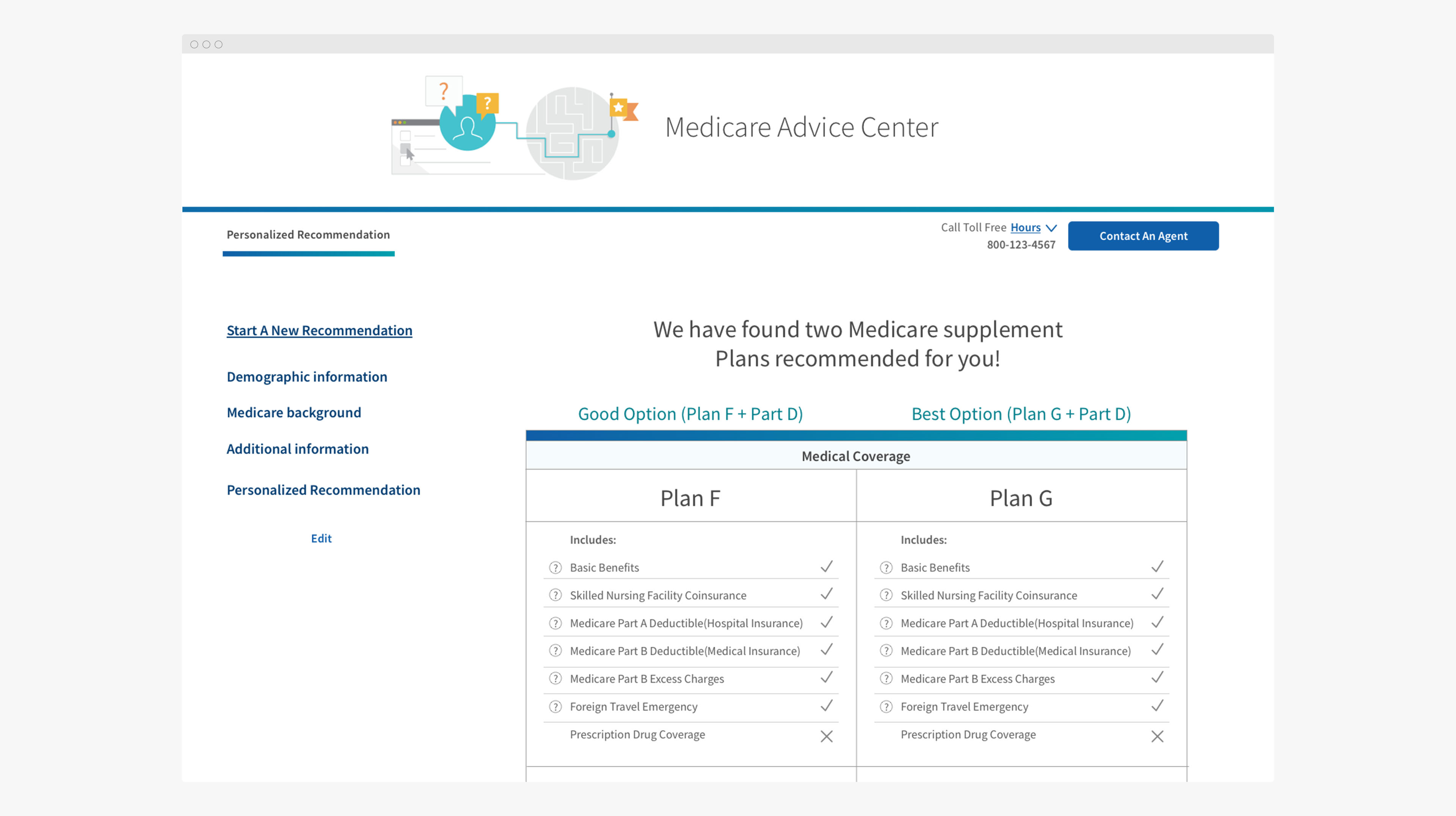
Final recommendation designed to reduce uncertainty and encourage confident next steps.

Supporting Navigation and Orientation
Because users were making high-stakes Medicare decisions, maintaining orientation throughout the flow was essential to reducing anxiety and preventing drop-off. The experience was designed to clearly communicate where users were in the process and what steps remained, helping them feel guided rather than overwhelmed.

Progress indicators and step-based navigation reinforced forward momentum while keeping the experience predictable and easy to follow. These UI patterns provided reassurance during the questionnaire and supported confident decision-making through to the final recommendation.

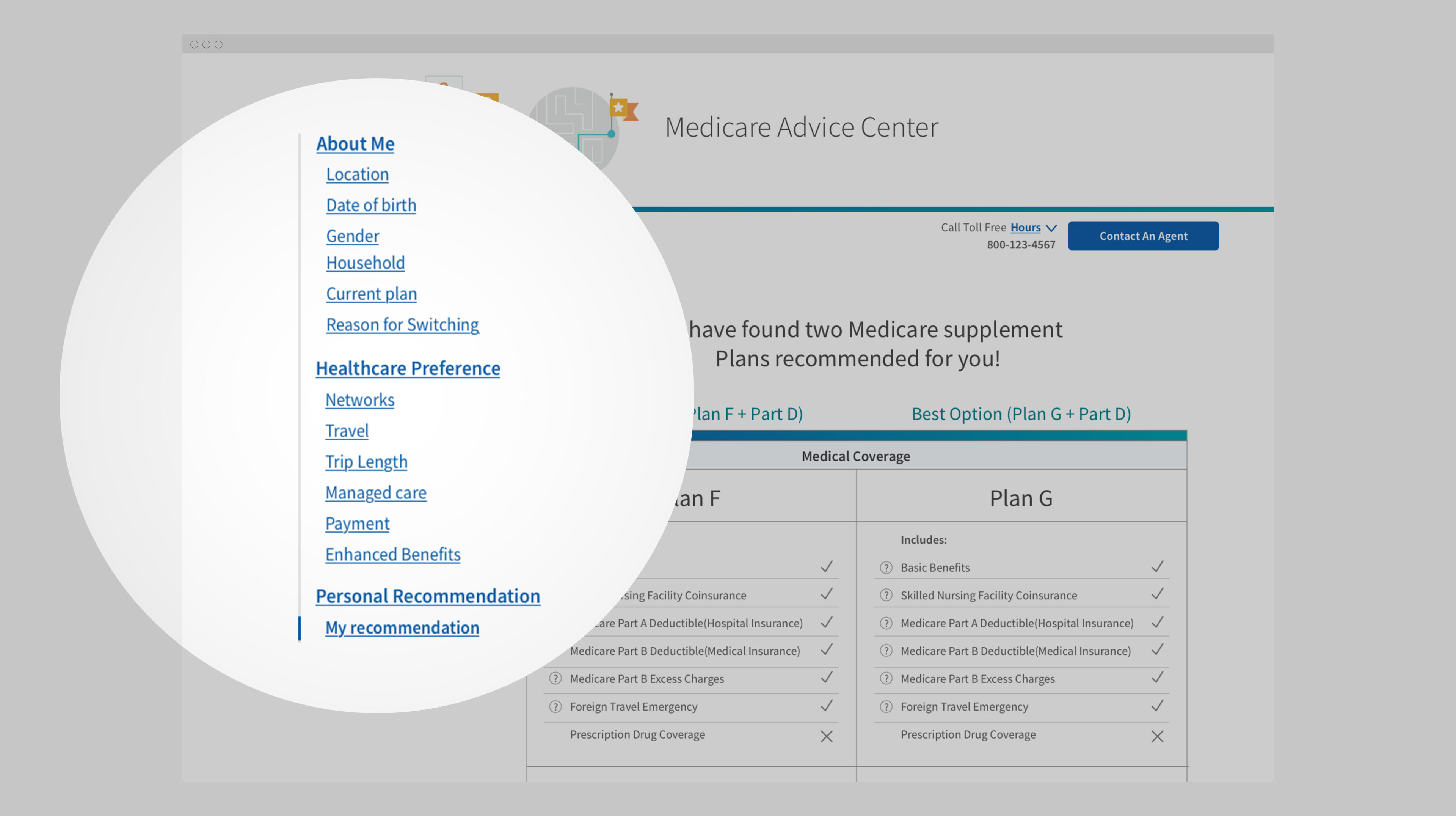
Progress cues designed to reduce anxiety and keep users oriented throughout the flow.

UX Process & Tools
  • Problem framing and stakeholder alignment
  • UX flows, wireframing, and UI pattern design
  • Design system alignment and collaboration
Impact & Key Takeaways
  • Created a clear, guided path through Medicare decisions
  • Reduced friction and uncertainty in a complex process
  • Delivered a scalable pattern for future advice experiences