| Case Studies / Lose It! |
AI-driven meal planning made simple.
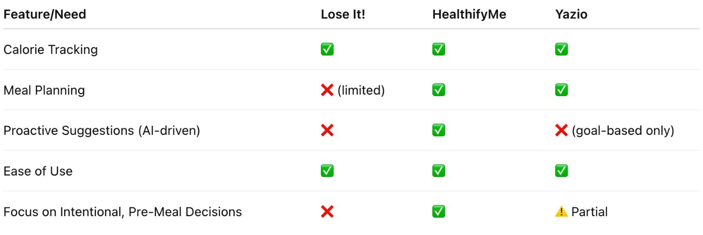
Case Study
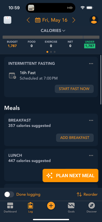
By introducing an AI planner at key decision moments, the design reduces friction in meal choice and supports habit formation through context-aware, personalized suggestions.
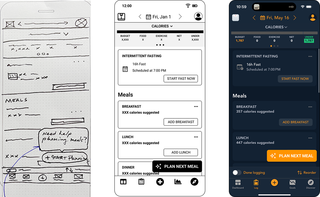
An iterative progression from low- to high-fidelity wireframes, refining how AI meal suggestions surface within Lose It’s existing tracking experience.
Recorded Figma prototype demonstrating the primary task flow, used to validate navigation, interaction clarity, and step-to-step progression.

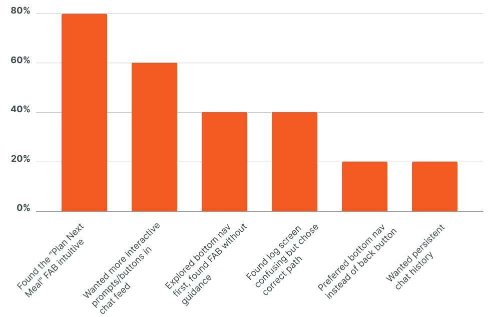
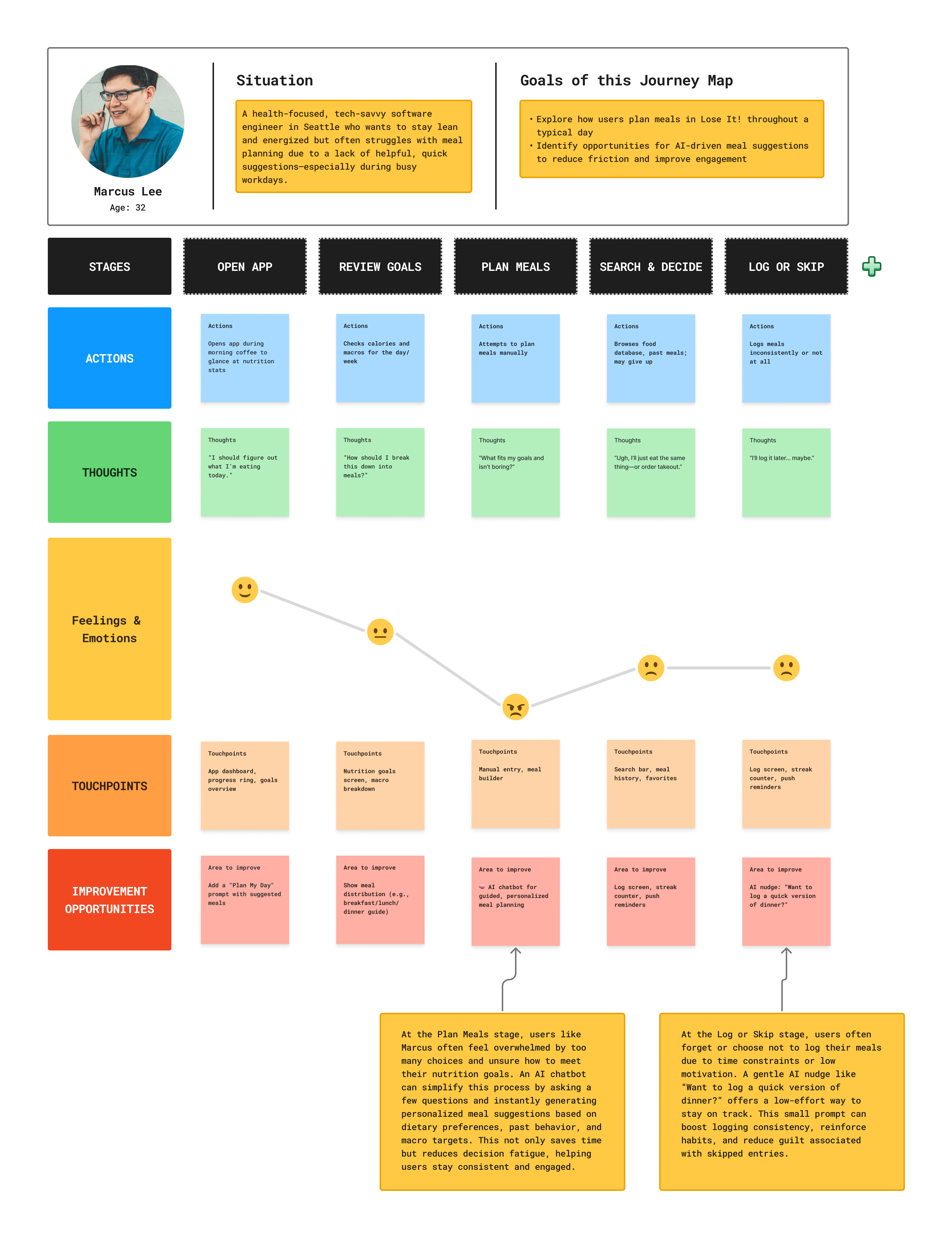
Summary of key usability findings from five user tests, highlighting intuitive use, feature requests, and navigation preferences.


